Panasonic asked us to help give their websites a fresh new look. The main goal was to update the UI across their different pages. The real challenge was making sure each section felt right for the specific people using it—since someone looking for a home phone has different needs than someone looking for professional gear—all while keeping a consistent global UX structure.
For the Telephone line, we really focused on accessibility and making sure the information was easy to read. We cleaned up the interface to make navigation simple and straightforward, so that anyone can find what they’re looking for without any vertical or confusing hurdles.
For the Telephone line, we really focused on accessibility and making sure the information was easy to read. We cleaned up the interface to make navigation simple and straightforward, so that anyone can find what they’re looking for without any vertical or confusing hurdles.
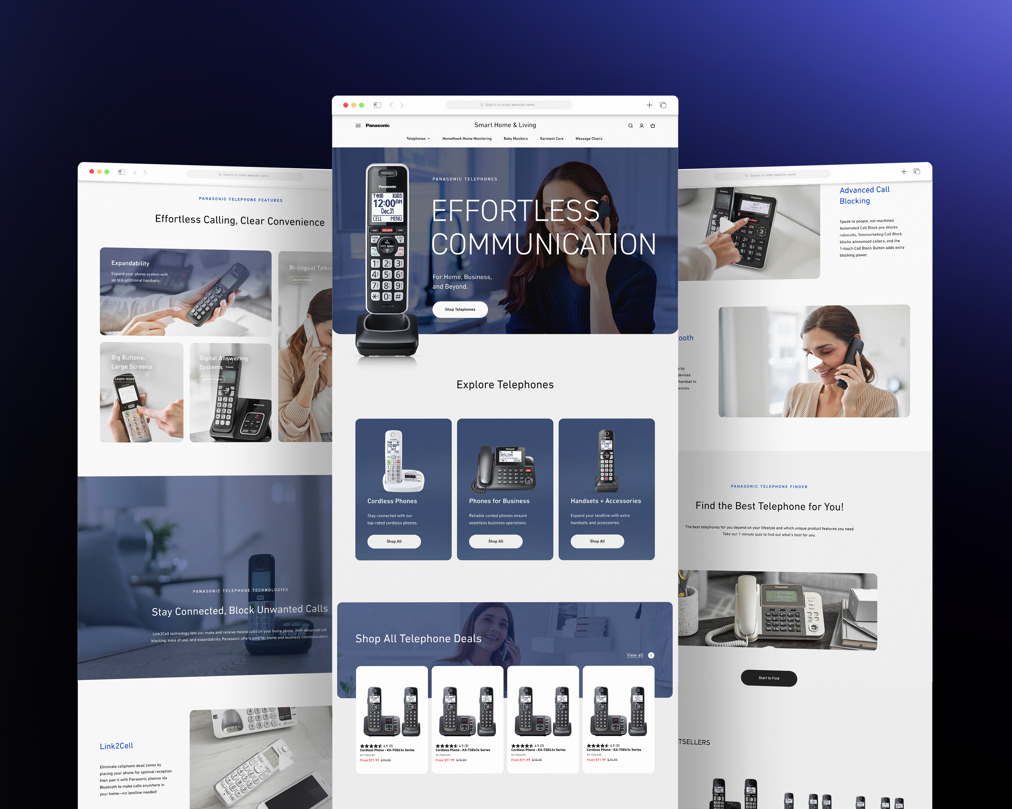
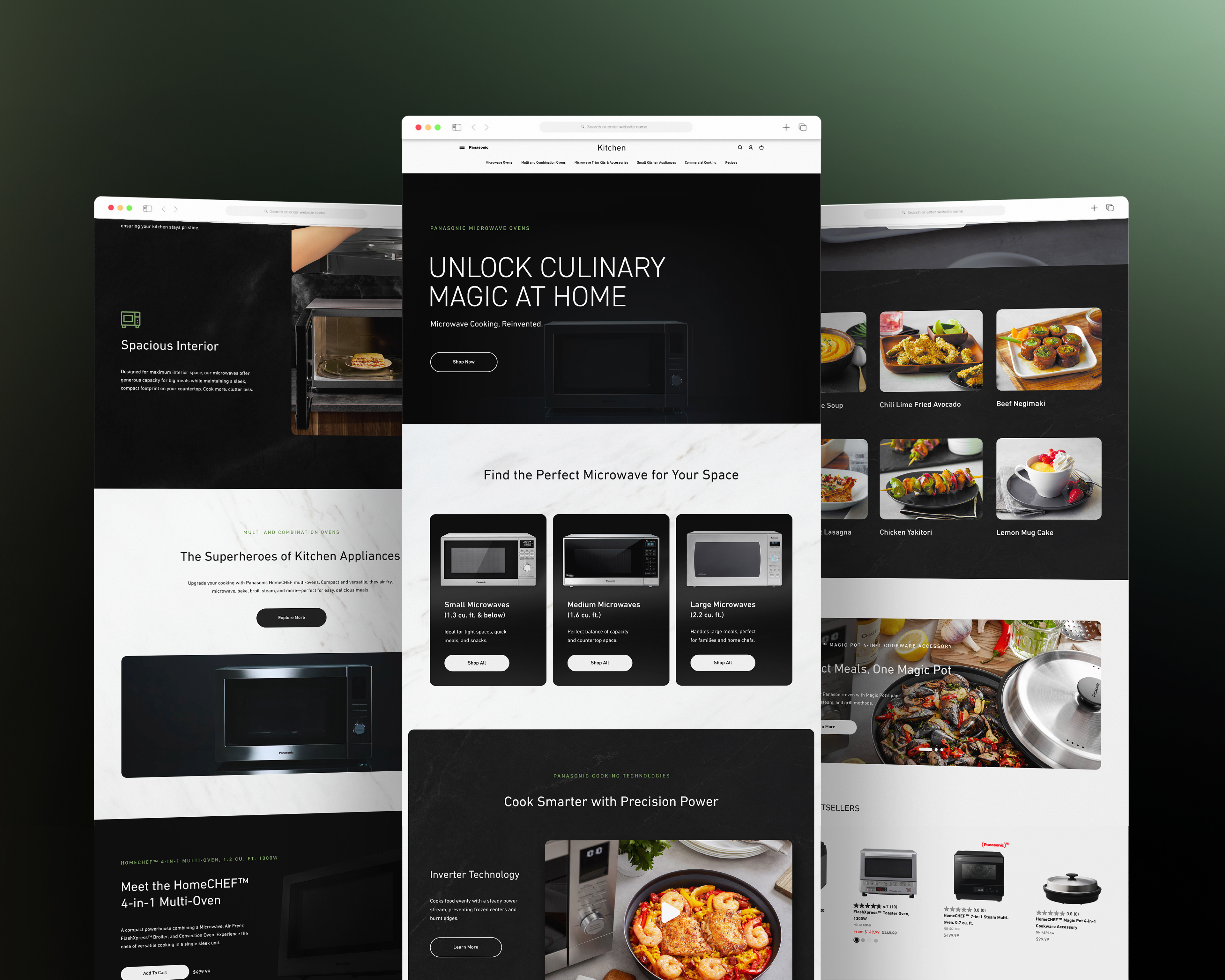
For the Microwave category, we changed things up to focus more on how these products fit into everyday life. We used imagery that really draws you in to show how the products actually work and to help drive conversion. By taking these two different paths, we made sure the digital experience matched up perfectly with what the business wanted to achieve.
Project Manager: Julio Arvizu
Creative Lead: Lyrra Partosa
Senior Designer: Carlo Delos Santos
Agency: Omni Channel Solutions | Channel Bakers
Tools: Adobe Photoshop | Adobe Premiere Pro | ChatGPT | Figma
Creative Lead: Lyrra Partosa
Senior Designer: Carlo Delos Santos
Agency: Omni Channel Solutions | Channel Bakers
Tools: Adobe Photoshop | Adobe Premiere Pro | ChatGPT | Figma